

Bridging the UX Gap: How I Turned Design Details into a Team Effort
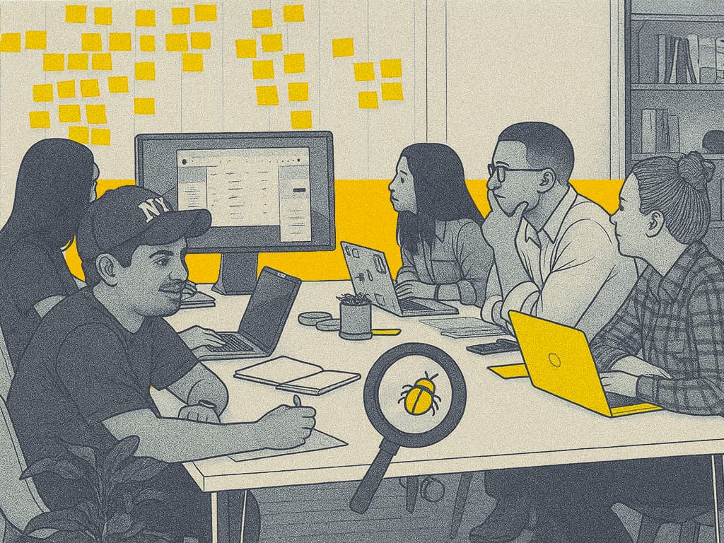
Turning design details into a shared responsibility
At m.Doc (a CompuGroup Medical company), I noticed something subtle but important. The designs we created in Figma didn’t always look or behave the same in the live product. Buttons acted differently, spacing felt off, and the polish we intended was missing. It wasn’t anyone’s fault. It was a missing bridge between design, QA, and development.
So I decided to build that bridge.
How It Started
As one of three UX designers, I reached out to the QA team to discuss these gaps. They were great at testing functionality, but visual and behavioral inconsistencies often slipped through. I showed side-by-side comparisons of the Figma design and live interface. Everyone immediately saw what I meant.
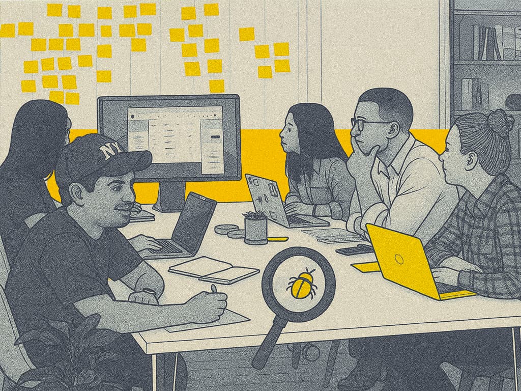
My lead gave me the go-ahead to start a small experiment — a UX Review process. It wasn’t easy at first. Our release cycles were already tight, but I knew this effort could make a real difference in the quality we deliver.
My Role
Role: UX Designer & Visual QA LeadTimeline: 2 months
Platform: Responsive Web Portal (Patient, Professional & Admin Interfaces) & Native App
Tools: Figma, Jira, Storybook, Confluence, ChatCGM, Postman
Collaborators: QA, 7+ Dev Teams, Product Owners, PMs
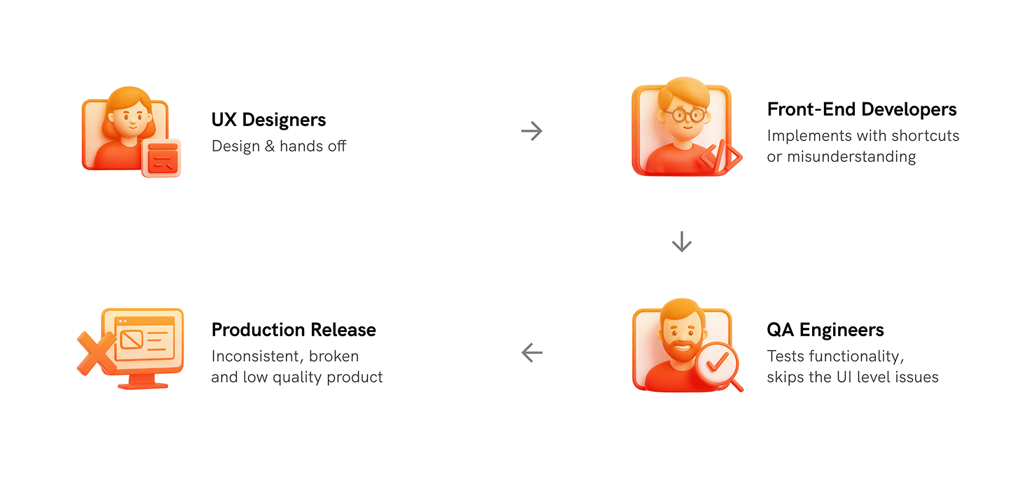
From Design to Delivery:
Where UX Quality Gets Compromised
Finding the Gaps
Even with documentation in place, design intent often got lost along the way. Here’s what was happening:
- QA focused on functionality, not finer design details
- Developers sometimes worked with outdated or incomplete references
- Style documentation existed but wasn’t consistently followed
- Design-level bugs were rarely reported
Each release had small visual inconsistencies that collectively weakened the experience.
What I Did: Launching the UX Review ⭐️
The first step was comparing development output with our Figma designs on desktop, tablet, and mobile. I reviewed screens in detail, flagged inconsistencies, and started logging bugs. Over the next four weeks, I reported more than 250 UI, UX, and behavioural issues. It was a lot of work, but necessary.
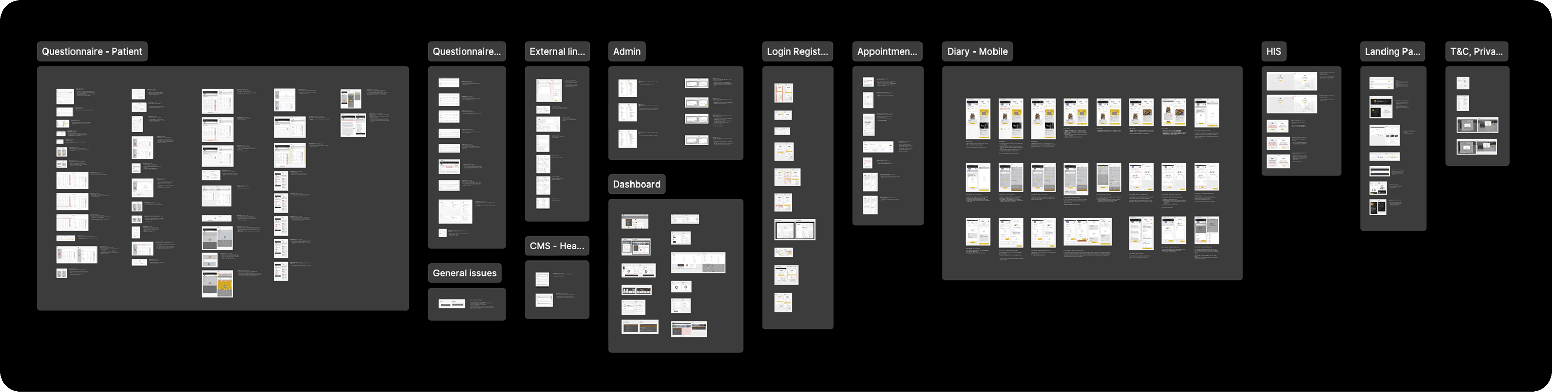
Surprisingly, I ended up logging 4–5 times more bugs than the QA team. Not because they weren’t doing their job, but because they weren’t looking through a design lens. It wasn’t about finding faults. It was about ensuring that design quality was treated with the same importance as functionality.
Smarter Reporting
Writing that many tickets manually wasn’t sustainable, so I built a faster system:
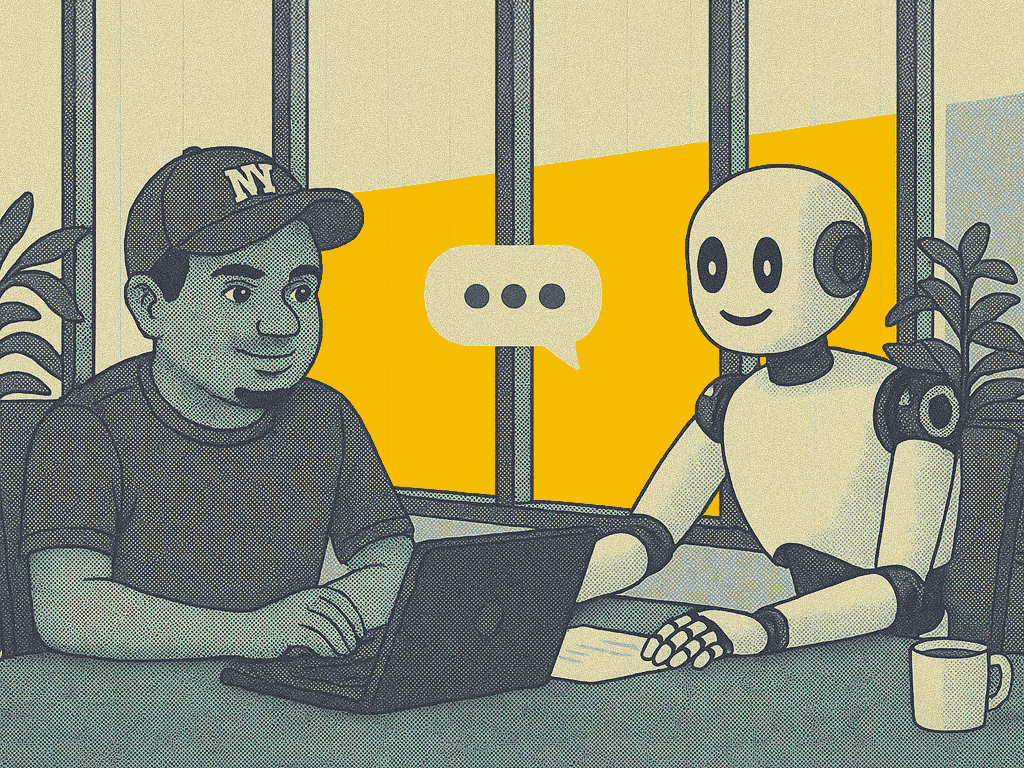
- Clear, structured Jira templates
- Side-by-side screenshots for easy reference
- AI-assisted ticket creation using ChatCGM to speed up repetitive reporting
This made reports easier to understand, faster to process, and quicker to fix.
Sharing Knowledge
To make the impact sustainable, I focused on empowering others. I conducted a training session for the entire QA team on how to use Figma Dev Mode effectively for testing. I explained how to inspect spacing, color values, typography, and component states directly from the design file.
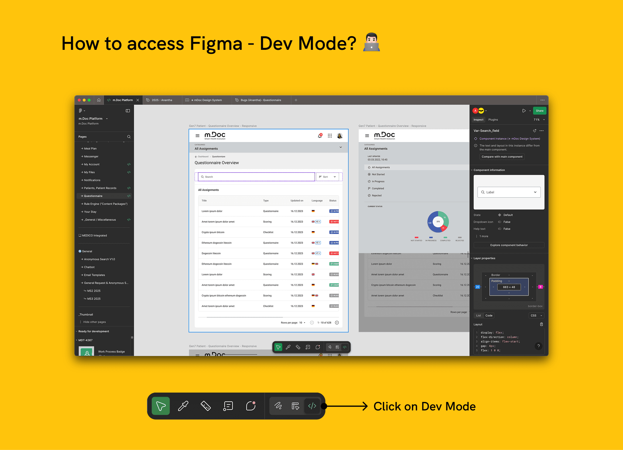
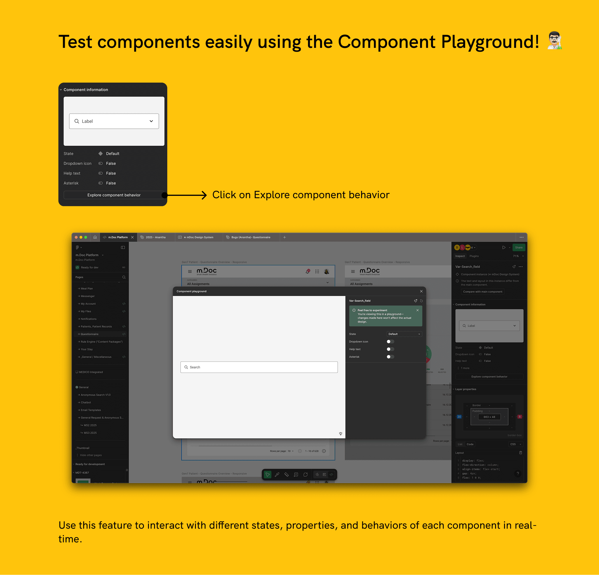
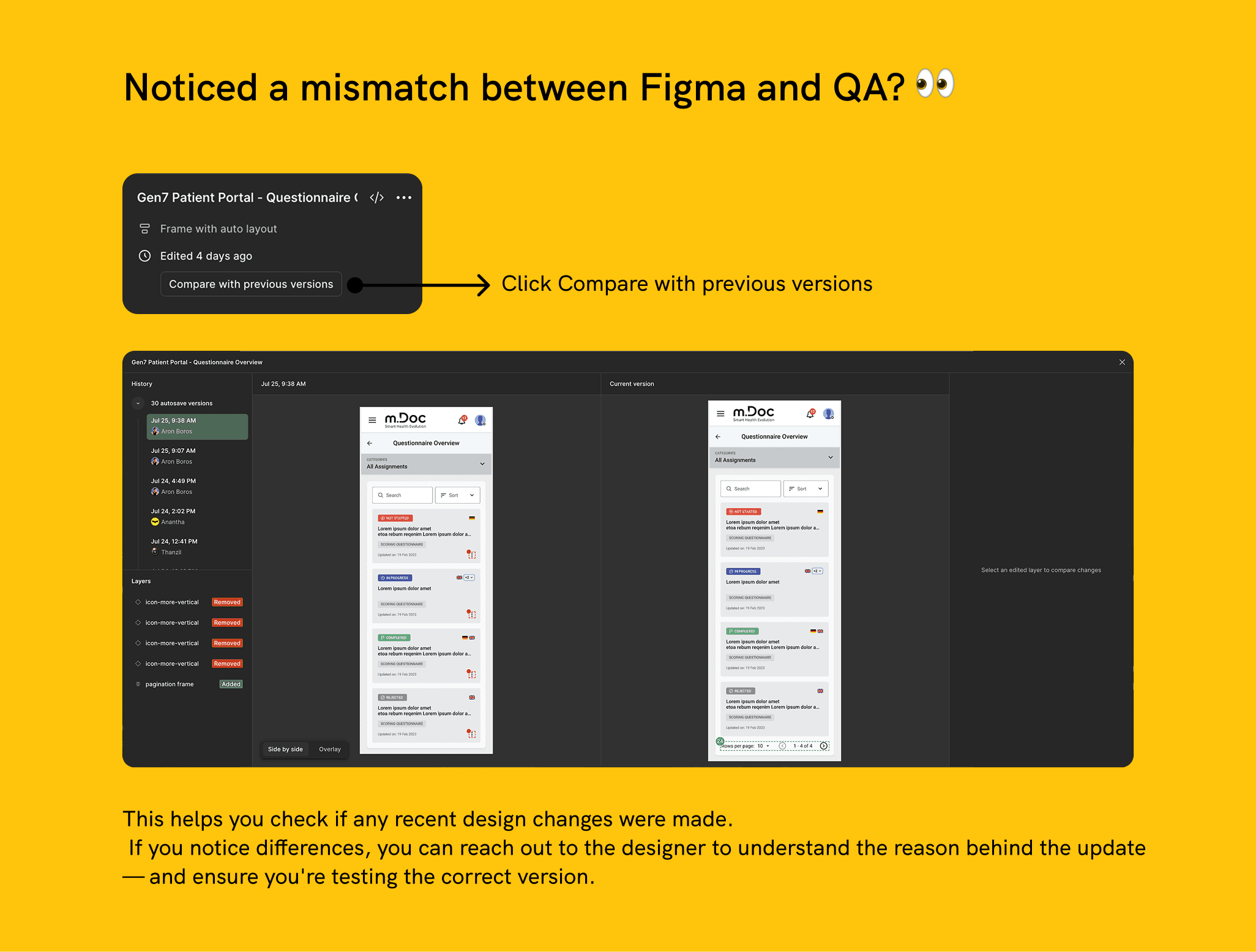
For developers, I organized short sessions highlighting common front-end mistakes and best practices. Together with the UX team, we created detailed design documentation on Confluence and a Front-End Quality Guide that summarized visual standards, spacing, typography, and component usage.
We also promoted Storybook as the single source of truth for verified components. These resources made visual consistency measurable and turned design accuracy into a shared responsibility.
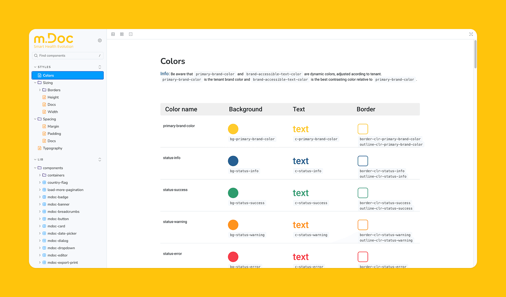
These steps made visual consistency measurable and turned design accuracy into a shared responsibility.
The Cultural Shift
- Over time, small changes built momentum.
- Developers began asking UX questions early.
- QA added UI checks to their test plans.
- Storybook and Confluence documentation became the go-to references.
We also introduced a new alignment rule: no Epic could be closed if front-end or UX-related bugs were unresolved. Even visual bugs reported by the UX team required confirmation before Product Owners could approve and close tickets. This ensured that every release met the expected design quality.
That single change raised the standard of delivery across all modules and made design integrity part of the release criteria.
The Results
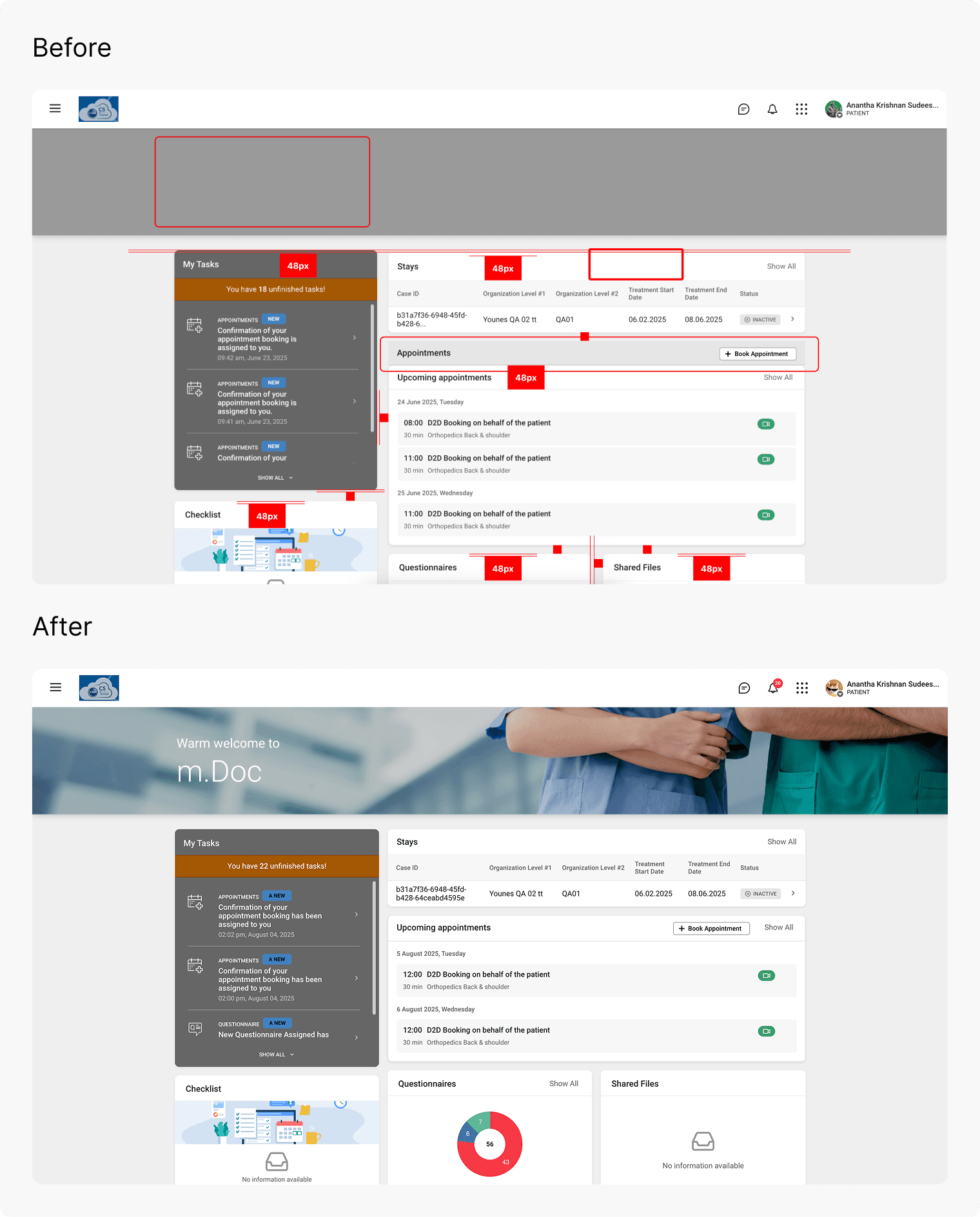
- Significant reduction in front-end bugs within two release cycles
- Faster issue resolution through structured reporting
- QA and developers actively referenced design documentation and Storybook
- ⭐️ The initiative was acknowledged in team retrospectives and received special appreciation from management
- 🏆 The VP and Head of Product personally recognized the effort as an example of proactive collaboration parallel to regular UX tasks
What I Learned
Sometimes, the most meaningful UX work isn’t about creating new features. It’s about protecting the integrity of what already exists.
Design quality isn’t a designer’s job alone. It’s a shared effort between design, development, and QA.
You don’t need a title to lead change. You just need to care enough to start :)