Design System
Design System for Xitester

How I created a scalable, responsive design system that reduced development costs by thousands.
About
Xitester is a no-code testing platform designed to make software testing accessible, scalable, and cost-efficient for users of all technical backgrounds. Built on insights from TestAssist, it simplifies complex testing workflows with a drag-and-drop interface, advanced features like distributed parallel test execution, real-time visualizations, and cross-platform automation.
To support Xitester’s mission, I created a scalable, responsive design system that ensured visual consistency and improved development efficiency. This system empowered designers and developers to work seamlessly, enabling faster iteration cycles and optimizing workflows.
Role
Lead Product Designer
Timeline
2024 – Ongoing
Disciplines & Responsibilities
- Design System Strategy & Implementation
- Design Tokens & Theming
- Component Library Development
- Documentation & Developer Collaboration
Tools
- Figma
- Storybook
- Jira
The Challenge
When I joined the Xitester team, design consistency was a major challenge. UI elements were being created and modified on an ad-hoc basis, leading to inconsistencies across the product. Developers were often forced to rebuild components from scratch, and designers spent excessive time reworking elements for each new feature.
Without a unified system, collaboration between design and development felt inefficient, and as the product scaled, these inefficiencies compounded. It was clear that something had to change.
The Turning Point: Making the Case for a Design System
I saw an opportunity to introduce a scalable design system that could bridge the gap between design and development. But first, I needed buy-in.
I initiated conversations with the product architect and founder, demonstrating how a well-built design system could streamline development, reduce inconsistencies, and save both time and money. By highlighting the inefficiencies caused by repeated design work and inconsistent UI elements, I showcased the long-term value of a reusable component library.
Once I had their support, I got to work.
Building the Xitester Design System
With leadership buy-in, I got to work creating a scalable, responsive design system from the ground up.
- Atomic Design Approach
I broke down the UI into its smallest reusable parts, creating a structured, modular system.
- Figma Component Library
I designed and documented a comprehensive library, allowing designers to easily pull in consistent, pre-built elements.
- Design Tokens
I standardized typography, colors, and spacing to maintain visual consistency across the product.
- Storybook Integration
I worked closely with developers to implement the system in Storybook, ensuring components were reusable in code, not just in Figma.
By structuring the design system this way, we created a scalable foundation that significantly improved efficiency, reduced inconsistencies, and streamlined the development process.
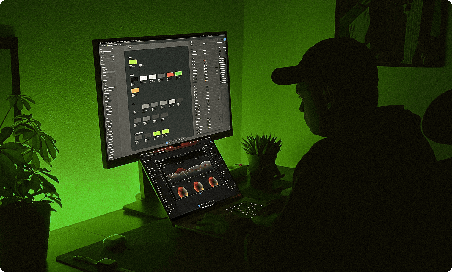
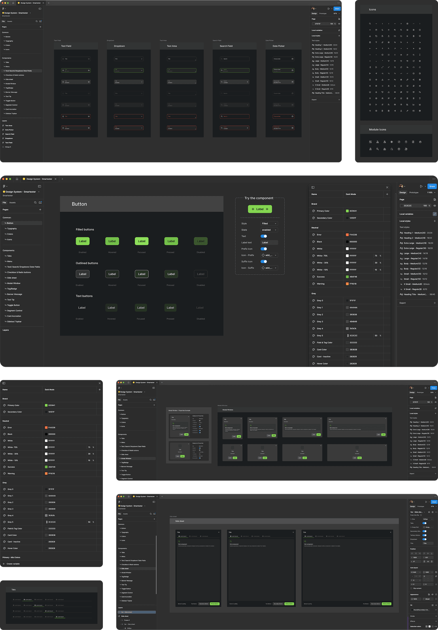
Design System in Figma
The Xitester Design System, built in Figma, is the foundation of our UI, ensuring consistency, scalability, and efficiency across design and development. Every component—from buttons and typography to complex UI elements—is structured with reusable properties and design tokens, streamlining iteration and ensuring a seamless handoff to development.
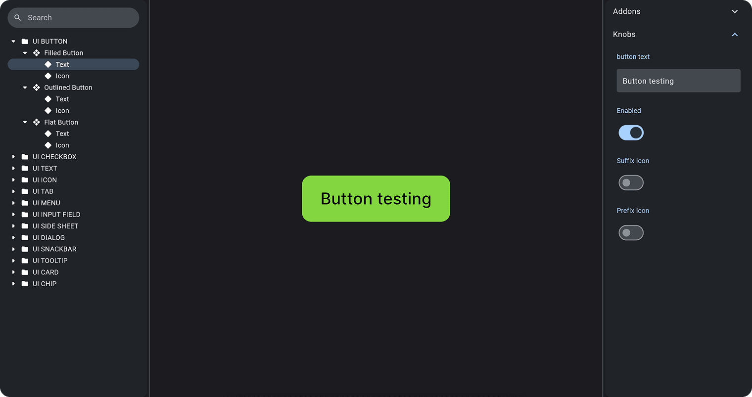
Component Library: A Scalable UI Framework for Designers & Developers
Built in Storybook, this component library provides a scalable and reusable UI framework for designers and developers. It ensures design consistency, modularity, and efficient collaboration by offering a fully documented set of UI components, including buttons, inputs, dialogs, and more.
Button Component — Key Capabilities
- Multiple variants (Filled, Outlined, Flat)
- Interactive properties (Text, Icons, States)
- A structured component hierarchy for maintainability and scalability
By integrating this system, we reduced design drift, accelerated front-end development, and created a single source of truth between design and code.
Decision-Making Process: Why These Choices?
Every design decision was made with long-term scalability and development efficiency in mind.
Design Tokens & Local Variables for Theming
- Instead of using local styles for colors, I implemented them as local variables.
- Why? This approach enables seamless Dark mode and Light mode switching, making future theme updates effortless without having to redefine styles.
- Impact: Faster customization and reduced development effort when introducing new themes.
Atomic Design for Reusability
- I structured components following atomic design principles, breaking them down into atoms, molecules, and organisms.
- Why? This makes each element highly reusable and reduces inconsistencies.
- Impact: Teams can build complex UI screens faster, knowing every component follows a predefined structure.
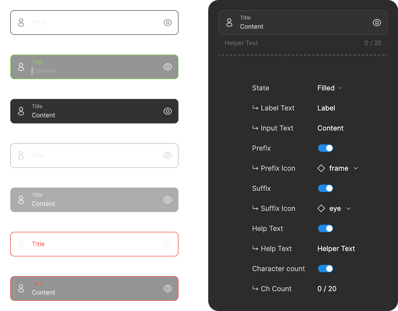
Component & Properties
Each component was structured to be flexible, scalable, and easy to use. Well-defined properties in Figma allow designers to quickly switch states, toggle icons, and adjust text without breaking components.
With Figma and Storybook kept in sync, handoffs are seamless, making the entire process more efficient for the team.
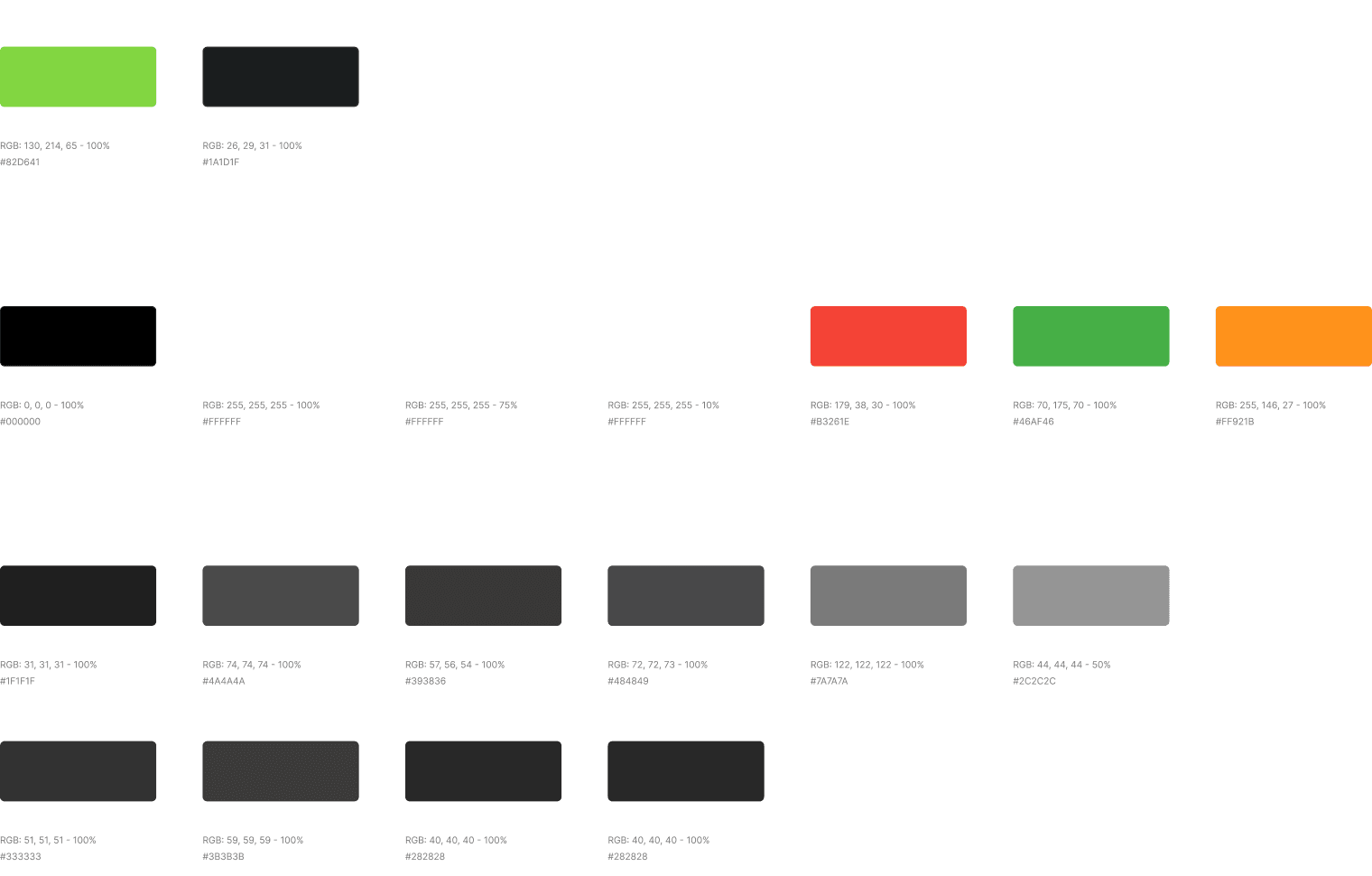
Color System & Theming
The color system was meticulously documented with clear usage guidelines and HEX codes to ensure consistency. Colors were added as variables, enabling easy integration and management.
With built-in Dark/Light theme switching, the system allows effortless adaptability and supports multiple branding needs.
Collaboration: Designer–Developer Sync
To ensure a seamless design-to-code workflow, I worked closely with the development team:
- Figma + Storybook Integration
Provided a single source of truth for UI components, reducing guesswork.
- Real-Time Feedback Loops
Used Teams and Notion to quickly address updates and improvements.
- Clear Documentation
Made it easier for developers to implement designs with precision, saving hours of development time.
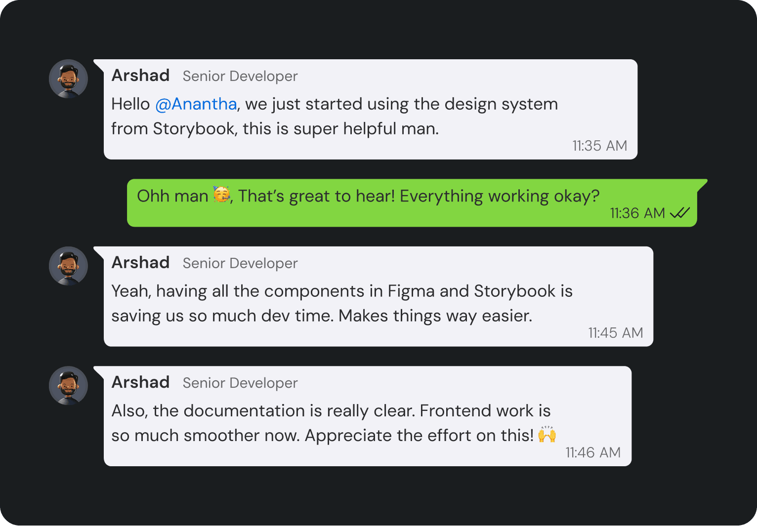
Message From the Founder
A note of appreciation for the impact of the Xitester Design System. It has streamlined our workflow, reduced costs, and set a high standard for design consistency across the team.
Hey Anantha,I just wanted to take a moment to thank you for driving the Xitester Design System forward. It’s been a game changer, not only in reducing development costs but also in bringing much-needed consistency between design and development.
Your vision has made things so much smoother for the team, and it’s been a huge help for our junior designers in maintaining high design standards. I really appreciate the effort and thought you’ve put into this. Excited to see how it continues to evolve!
Shine Oovattil
Founder at Xitester
Impact
The results were transformative:
- Enhanced collaboration between designers and developers, ensuring seamless handoffs
- Eliminated inconsistencies across the product, creating a unified user experience
- Accelerated development by reducing repetitive work and streamlining component usage
- Significant cost savings, reducing thousands of euros in redundant work and last-minute redesigns
Beyond efficiency, this project established a scalable foundation for Xitester, enabling the team to iterate faster and maintain high design standards as the product grows.
Thank you! 😊
I want to express my gratitude to the Xitester team for their trust and collaboration in bringing this design system to life. Special thanks to the developers who worked closely with me to ensure seamless implementation, and to the leadership team for recognizing the long-term value of design consistency. This project was a true team effort, and I’m proud of what we accomplished together.