

Designing Conversational UX for Digital Healthcare
Overview
The m.Doc Smart Health Platform, part of CompuGroup Medical (CGM), connects hospitals, professionals, and patients through one digital ecosystem. As the platform expanded, one challenge became clear: how can we communicate complex healthcare processes to patients in a way that feels clear, supportive, and human?
We introduced conversational UX to improve how the product speaks with patients. Instead of adding more static help, we designed a contextual communication layer that uses short, natural language and task-oriented guidance.
I worked with Patryk Burek (AI Product Owner and Manager) to align this work with m.Doc’s product vision and business goals. My role covered UX strategy, communication design, interface design, usability, and testing. This was the first version of the MVP, and I am actively collaborating on upcoming features.
Why conversational UX here
Internal feedback and client conversations showed three recurring pain points:
- Patients struggled to find information and complete basic actions
- Hospitals handled repetitive questions that added operational load
- Tone and clarity varied across modules, eroding confidence
Conversational UX fits because it focuses on intent, context, tone, and timing. Every message should move the user closer to a goal, in language that feels clear and human.
Research and Insights
I ran short discovery sessions with Product Owners, Product Managers, the VP of Product, and consulted Sales and Project Management who speak with hospitals daily. Patterns were consistent: users needed clearer next-step guidance, clinics wanted smoother onboarding and self-service, and teams needed a unified voice.
From this, I framed two options:
- Global search to improve discoverability
- Conversational communication layer to guide tasks in place
Leadership selected the conversation-based approach for higher strategic impact and stronger product differentiation.
Principles and Framework
To operationalize conversational UX, I defined a lightweight framework:
- Intent first: each turn aims at a user goal, not a generic reply
- Context aware: responses adapt to where the user is in the journey
- Natural tone: short, human sentences in m.Doc’s voice
- Single action per message: remove ambiguity and reduce cognitive load
- Graceful recovery: helpful fallbacks when input is unclear
I documented principles and examples so teams could reuse them across modules.
From Idea to MVP
We set a focused scope to show value quickly. Patryk’s team delivered the backend prototype. I partnered on testing and communication refinement.
Early responses were technically correct but long and formal. I applied m.Doc’s UX writing guidelines to make messages shorter, clearer, and action-oriented.
Before:“The document upload functionality can be accessed via the sidebar navigation.”
After:
“You can upload your document by tapping the paper icon on the left.”
I also supported like a QA collaborator, validating response accuracy, flow logic, and readability across desktop, tablet, and mobile.
Interface Design
I designed a simple, responsive conversation interface using the m.Doc Design System and Storybook components to minimize delivery cost and ensure trust through visual consistency.
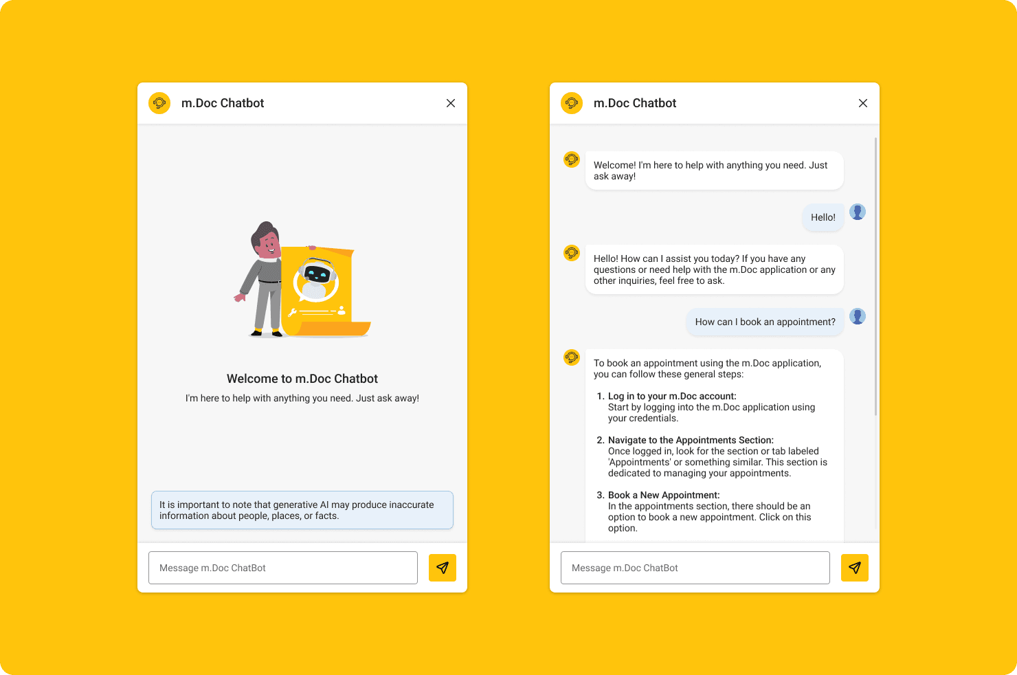
Key choices: compact message blocks, predictable spacing, legible typography, and widths that support longer answers without clutter. Everything followed accessibility standards and was built to scale to new modules.
Collaboration and Delivery
I worked closely with Patryk’s development team to align backend behavior with the conversation framework and UI. We prioritized clarity, low complexity, and fast iteration using existing components.
The MVP was demoed internally and received strong feedback for improving guidance while fitting naturally into the product. I was recognized for contributing alongside my core UX responsibilities.
Outcome
The first version is live with partner hospitals and shows measurable impact:
- 💬 25% fewer repetitive inquiries
- 👥 +14% better onboarding completion
- ⚡ Faster and clearer patient assistance
- 💛 +0.7 higher satisfaction rating
- 🔒 GDPR-compliant communication within the platform
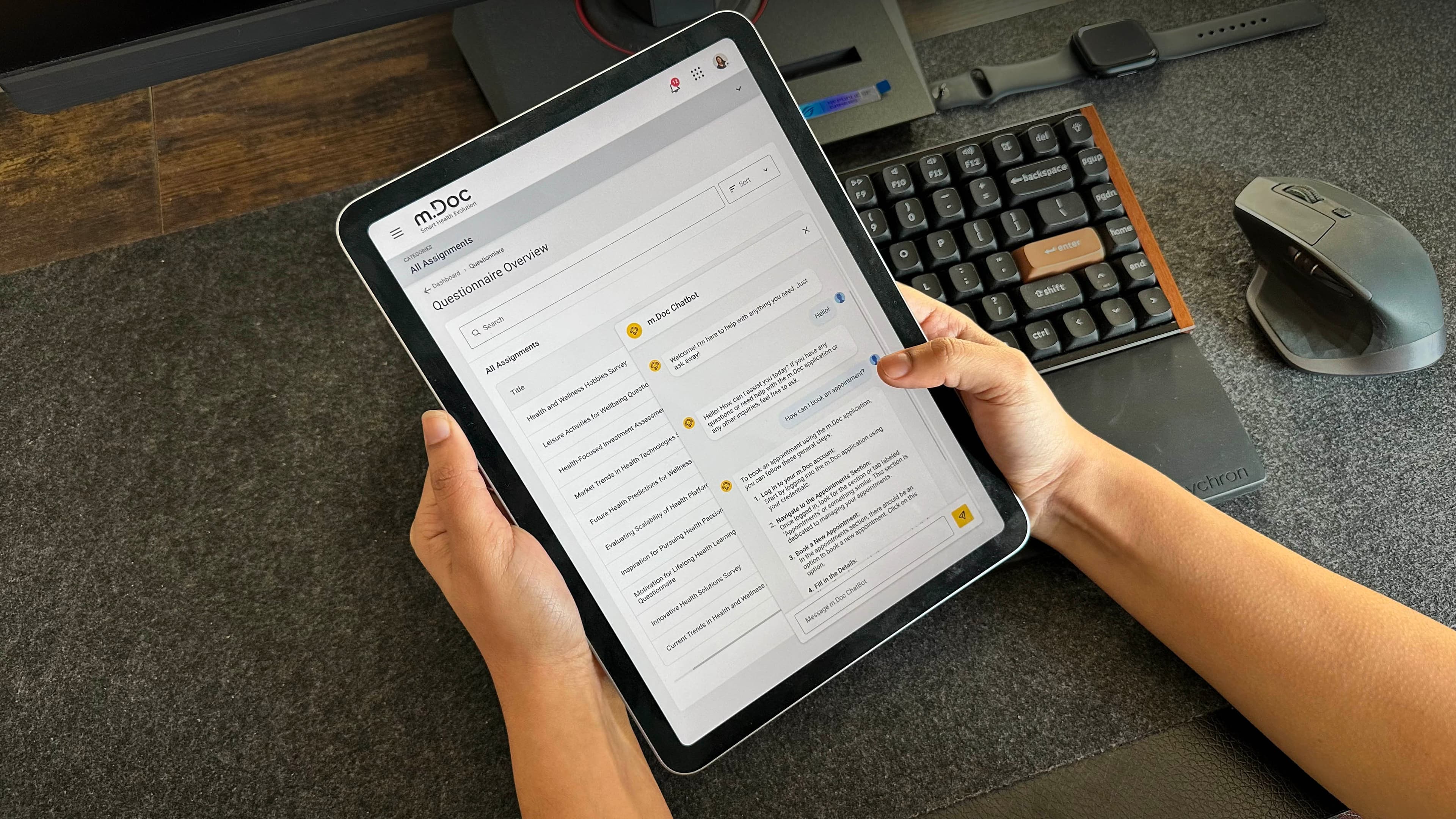
Beyond the metrics, we now have a reusable conversational UX pattern and tone that other teams can adopt, increasing consistency and reducing future design and support costs.
What I would improve next
- Deeper context awareness: tailor responses by user role (patient, professional, admin) and recent actions
- Multilingual expansion: consistent tone and clarity across languages
- Analytics on turns: track drop-offs by step and optimize flows
Reflection
This project reframed communication as a core product capability. By treating every interaction as a conversation, we reduced confusion, increased confidence, and lowered support load.
It also set a foundation for future features that use conversational patterns responsibly to make healthcare feel clearer and more human.
This is version one. I am actively collaborating with the team on the next releases to expand coverage, improve intent recognition, and deepen integration with patient and professional workflows.