Healthcare UX · Case Study
m.Doc - Designing a patient portal for German hospitals : Healthcare UX
UX Designer
m.Doc GmbH (acquired by CompuGroup Medical SE & Co. KGaA in April 2023)
Cologne, Germany 🇩🇪
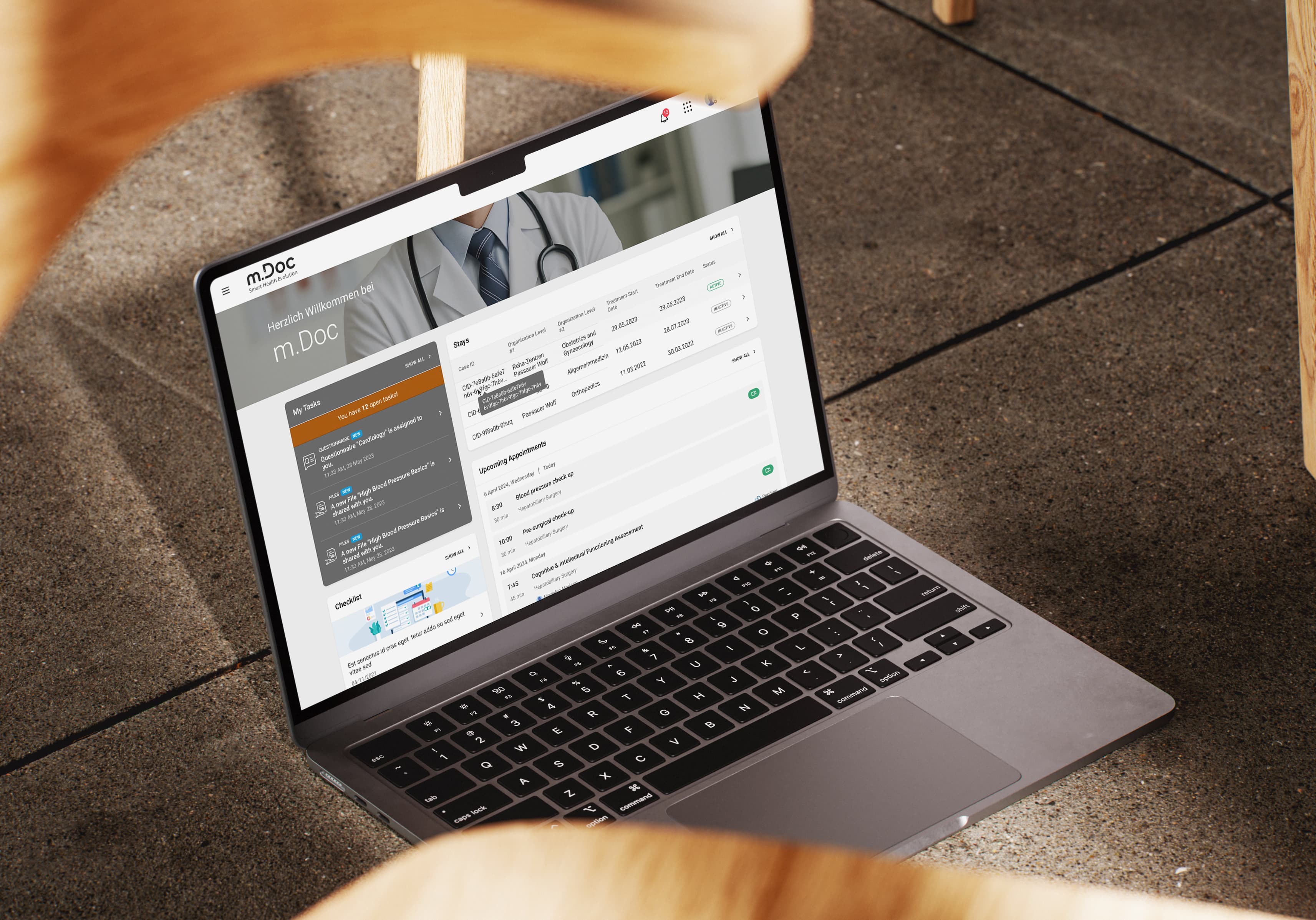
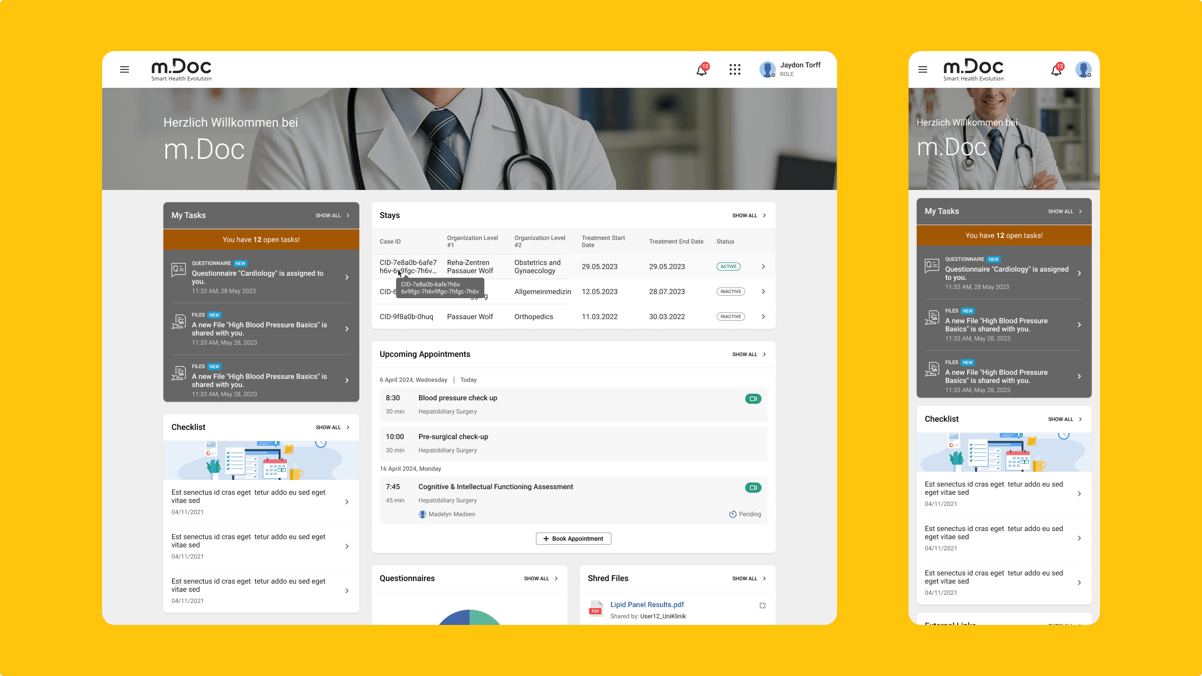
m.Doc is the patient portal German hospitals put in front of their clinical systems. Patients use it to request and book appointments, prepare for admission, follow their treatment, and stay in contact through aftercare. By the time CGM acquired it in 2023, the platform was already serving more than 300 hospitals, rehabilitation, and care facilities. (source) Behind that simple promise sits a hard design problem: the same journey has to hold together across desktop, tablet, mobile, and native apps, while fitting inside real clinical workflows and the rules German healthcare runs on.
I work as a UX Designer on the Seventh Generation of the platform. It is the work of a large team, so I want to be clear about scope. I owned specific modules and a set of responsibilities that grew over four and a half years, and what follows is the part I can speak to in detail.
When I joined, Generation 7 was already underway, built on the success of Gen 6 and a base laid by the designers before me. My job was not to start fresh but to push a moving product forward: lift the visual quality and modernise the experience without destabilising what already worked.
My role
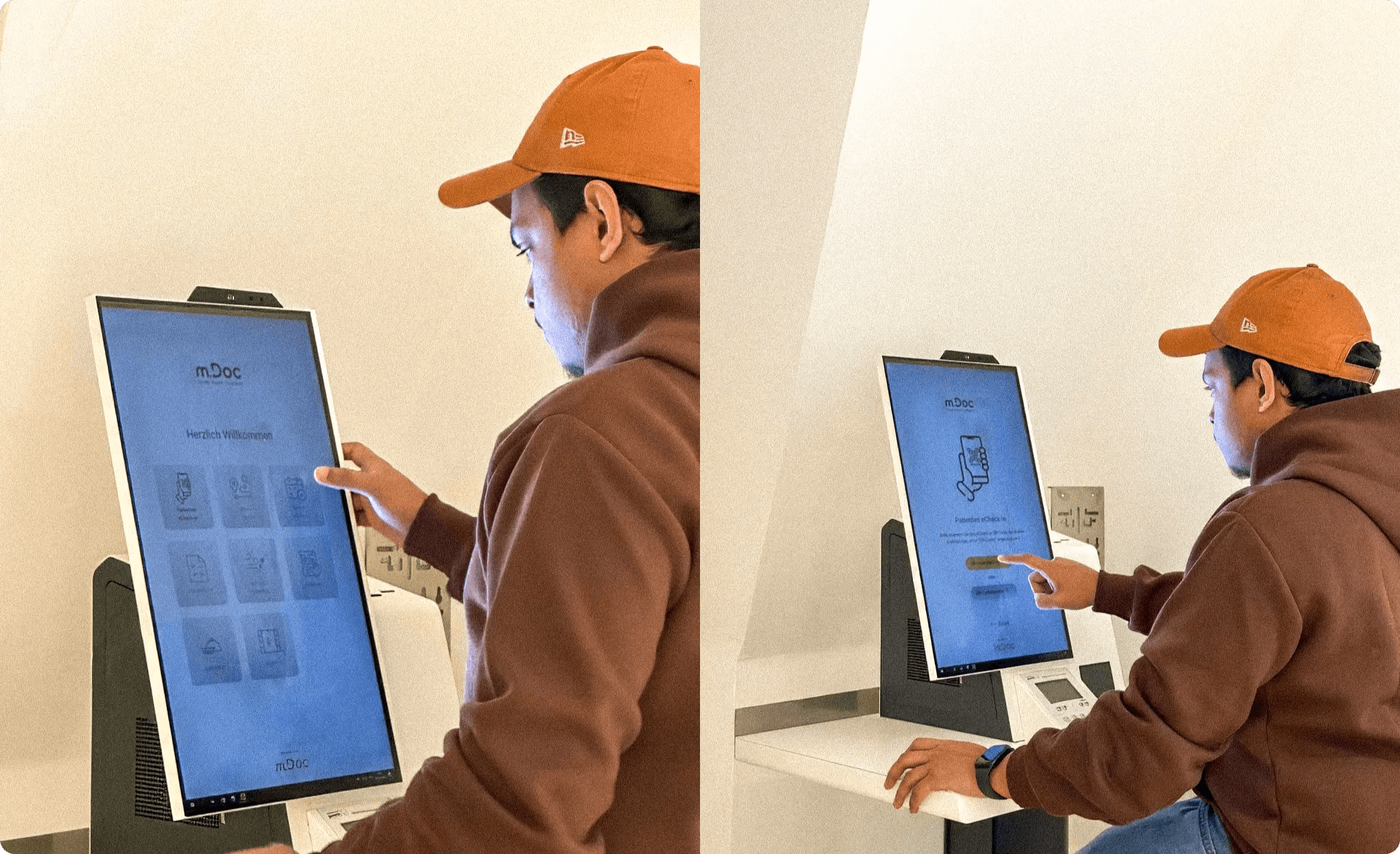
UX Designer, Digital Health. m.Doc is a multi-user product, designed for three groups with very different needs: administrators, clinical and professional staff, and patients. It runs across desktop, tablet, mobile, native apps and now a PWA, and also on the bedside terminals and self-service kiosks inside the hospitals themselves, so every decision had to hold up across personal devices and shared hospital hardware alike. Day to day, I was responsible for:
- Owning the end-to-end UX for several product modules, keeping the experience coherent for all three user groups across every breakpoint
- Leading responsive UX across every surface, from personal devices to shared hospital hardware
- Running user research and usability testing to ground design decisions in evidence rather than assumption
- Scaling and documenting the design system, with reusable components and tokenised assets
- Establishing a UX Review process that protected design intent from Figma through to production
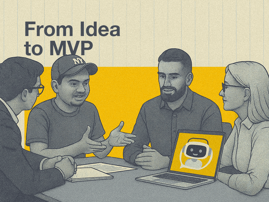
- Designing patient-facing conversational AI for the platform, including fallback logic, human-handoff, and patterns for AI transparency and consent
- Bringing AI-powered automation into internal design workflows to speed up the design-to-delivery loop
- Partnering with Product, Engineering, and QA in an agile setup
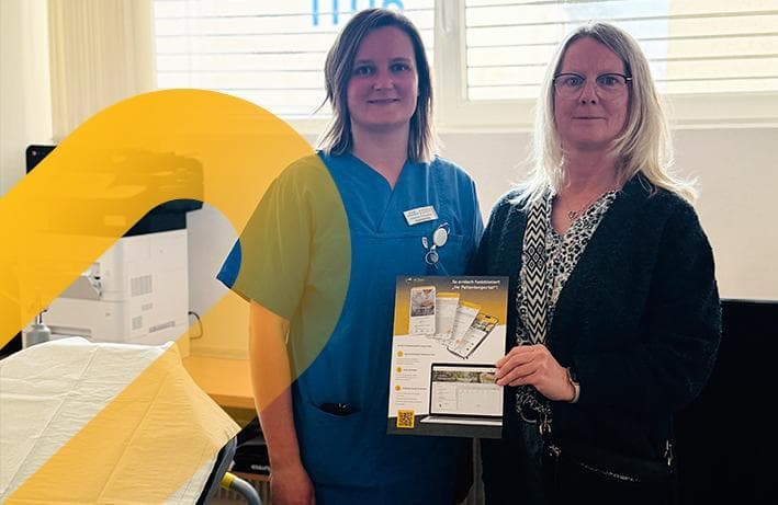
The platform I work on went live at its first deeply integrated CGM MEDICO site in 2025, the Städtisches Krankenhaus Maria-Hilf Brilon, beginning in trauma surgery and orthopaedics. Patients there now use it to book appointments such as pre-op preparation and to keep their letters and reminders in one place. (source)
What needed fixing
By the time I was working on it, the older generations of the platform had built up a familiar set of problems. Navigation had grown complex, design patterns were inconsistent from one user type to the next, and the mobile experience trailed the desktop one. Patients could feel overwhelmed, clinical staff lost time to administrative steps, and the platform was under pressure to scale as more hospitals came on board. It also had to serve three different groups at once, each with its own needs: patients, the clinical and professional staff treating them, and the administrators who run the system.
Constraints and challenges
Designing for German hospitals means working inside boundaries you do not get to move. These are the ones that shaped the work.
- Healthcare interoperability standards. The portal had to comply with HL7 v2 and HL7 FHIR so it could exchange data cleanly with the systems hospitals already run.
- HIS integration complexity. It had to integrate with existing hospital information systems such as CGM CLINICAL, Telekom iMedOne, and ORBIS-KIS without disrupting the clinical workflows already in place.
- Regulatory compliance. Handling sensitive patient health data meant strict GDPR and data security requirements were non-negotiable.
- Accessibility. The design had to work for users of every age, technical ability, and health condition, with WCAG 2.1 AA as the target.
- Multi-stakeholder needs. It had to balance patients, clinical staff, administrators, and IT teams at once, each with different priorities and different levels of technical literacy.
- KHZG funding criteria. It had to meet the German Hospital Future Act (KHZG) requirements for digital patient services and interoperability, which is what makes it fundable for the hospitals adopting it.
A five year journey: Before and After
When I joined, Gen 6 was a proven product that had hit its ceiling. Five years on, Gen 7 is a different experience. The interoperable architecture underneath it was the team's engineering achievement, and it made new things possible. What follows is the design side, the part of the shift I worked on.
| Gen 6 (before) | Gen 7 (now) | |
|---|---|---|
| Signing in | A patient with three hospitals juggled three logins. Anyone who was both a professional and an admin kept two separate accounts. | One account across hospitals, and one platform across roles. Users switch between hospitals and between admin and professional views in place, only where they have access. |
| Navigation | Difficult to move through, with users dropping out of flows before finishing. | Clearer navigation and flows shaped around completing the task. |
| Accessibility | Gaps against healthcare and accessibility guidelines, including colour-contrast and colour-blind issues. | Designed toward WCAG 2.1 AA, with accessibility treated as a requirement, not an afterthought. |
| Consistency | Inconsistent components and non-standardised patterns from one part of the product to the next. | A documented, tokenised design system holding one standard across every surface. |
| Coherence across surfaces | The experience varied between web, mobile, and hospital hardware. | One coherent journey across desktop, tablet, mobile, native, PWA, bedside terminals, and kiosks. |
The role and hospital switching was designed on top of the interoperable architecture the team built. The rest of this column, the navigation, the accessibility, the design system, and the coherence across surfaces, is the design work I owned or contributed to directly.
The design system,
and the everyday reason it mattered
I owned several product modules from start to finish, which meant living with the problem every responsive designer knows. Consistency is easy to promise and hard to keep once a product is large enough that no single person sees every screen. We were re-deciding the same spacing, the same states, the same breakpoint behaviour in different corners of the product.
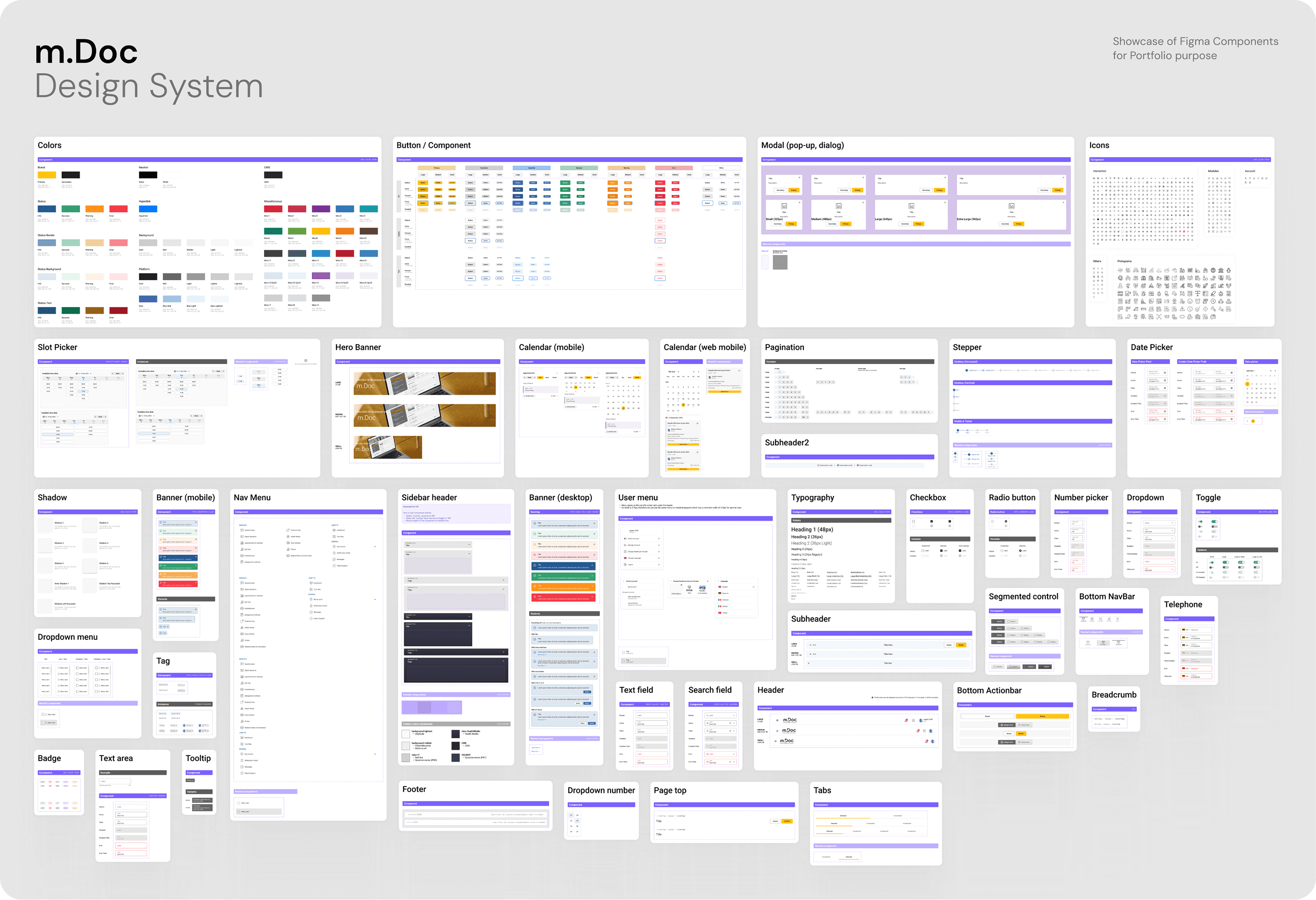
So I put real effort into the design system. I scaled it into reusable components, tokenised the values underneath them, and documented the whole thing so the rest of the team could use it without coming to me first. Tokens held the decisions, components held the behaviour, and the documentation meant a designer who had just joined and I would land on the same result. The payoff was not glamorous. It was that a change made in one place stopped quietly breaking three others.
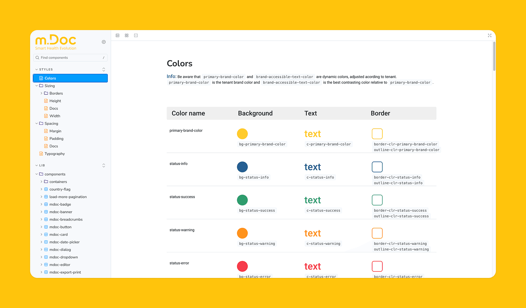
A later UX audit led by CGM's head of UX recognised the team's design work and the documentation behind the system, which was welcome validation that the rigour we put in held up under senior review.
A review habit that kept design from leaking on the way to production - Read Case study
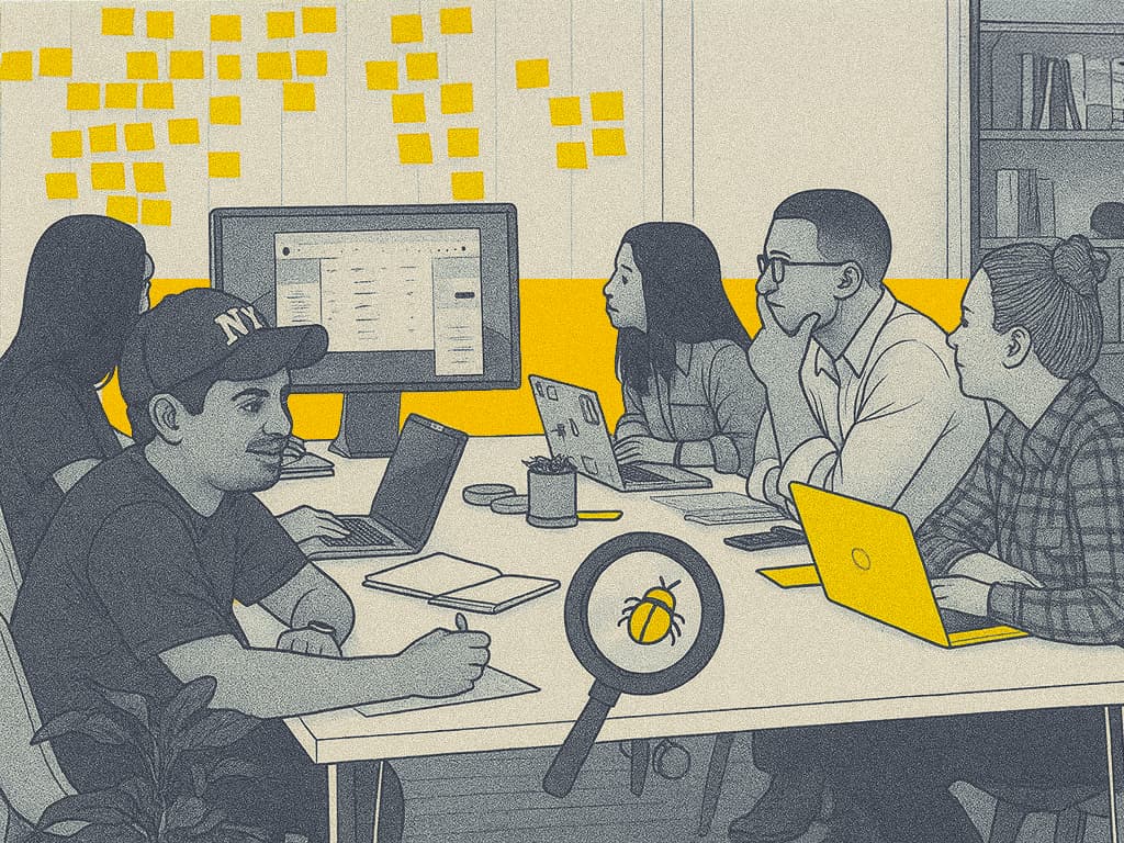
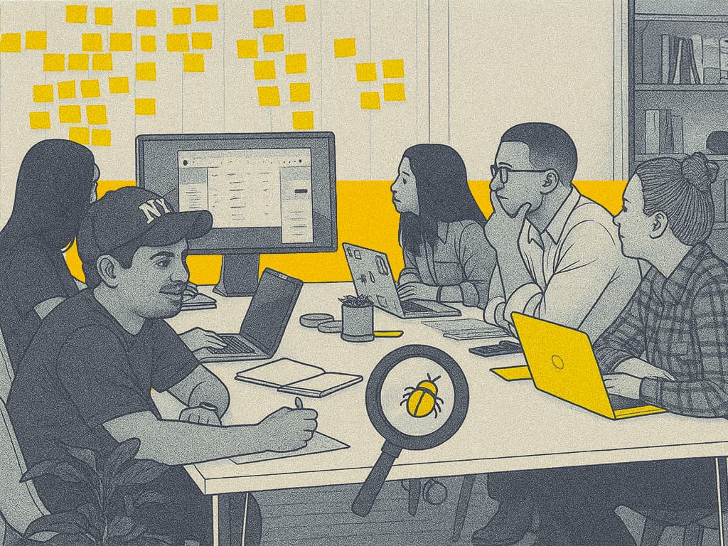
The gap between a clean Figma file and what ships is where a lot of design quality disappears. I set up a structured UX Review so that gap had someone watching it. Part of that was process. Part of it was me opening the built product and clicking through it the way a patient would, checking that what went live matched what we had designed.
It shifted the team's default. Quality stopped being something we hoped survived the handoff and became something we checked on purpose. The German Design Award the team won in 2024 was welcome recognition. The change I valued more was quieter: fewer surprises at release.
Using AI where it saved time, not where it looked impressive
This is the newest part of my work, and I treat AI the way I treat any tool: reach for it where it clears real friction, leave it where it does not. A few places it earned its keep.
I used Lovable to stand up a rough, working version of a new feature before committing it to Figma, which made it faster to feel out whether an idea held up before investing in polish. For repetitive automation, including bug reporting and other handoffs, I leaned on Windsurf and Copilot, and used Figma Make to speed up parts of the design work itself. For the everyday load around the work, documentation, research, general write-ups, I used CGM's internal ChatCGM.
None of this replaced the design thinking. It cleared the busywork around it, so more of my time went to the decisions that actually needed me. I can walk through exactly where each tool helped and where it did not, which matters to me more than calling any of it transformative.
This section is about AI inside my own workflow. The patient-facing side, the conversational AI with its fallback logic, human-handoff, and consent patterns, is a separate and more involved piece of work, written up in its own case study below.
What I would do differently
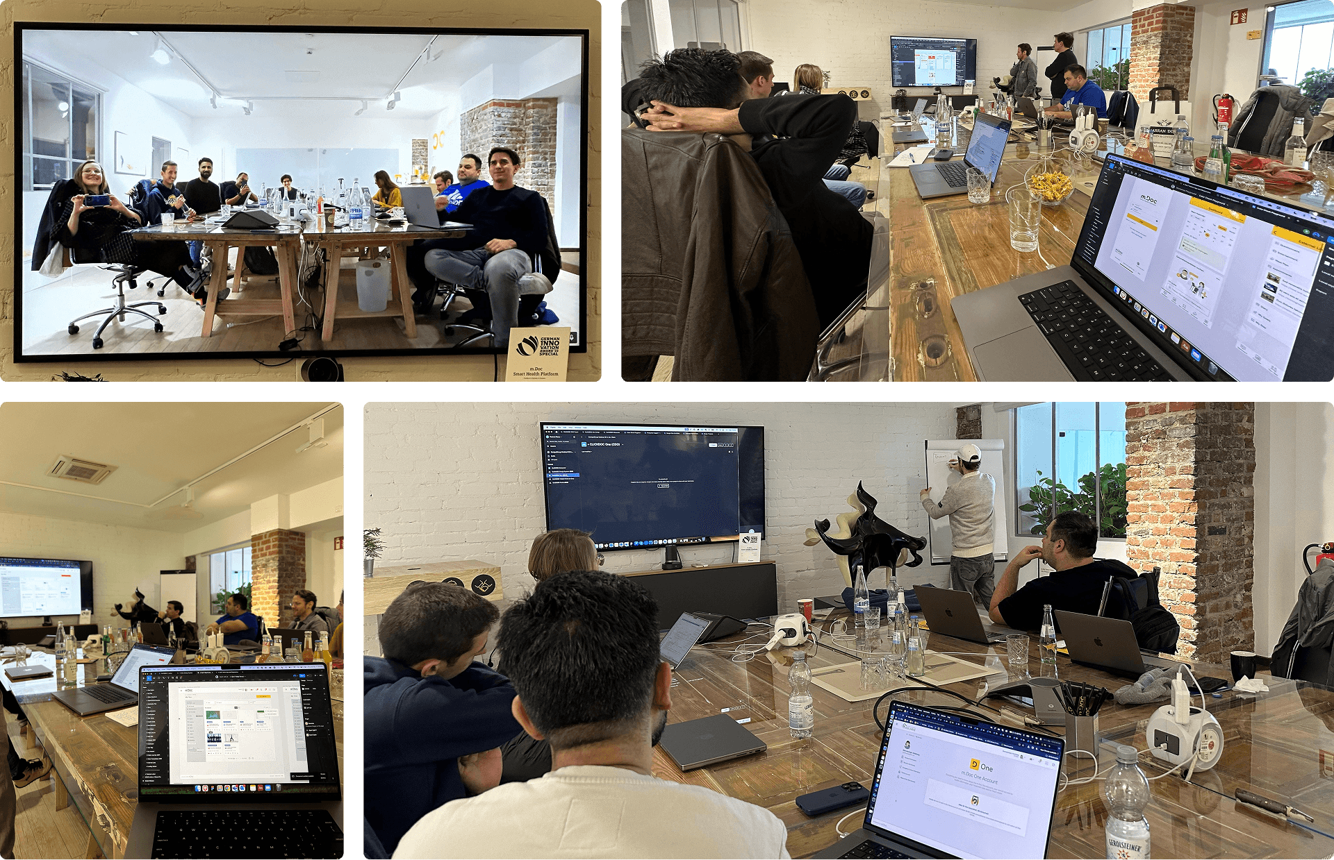
The attempt - CGM acquired m.Doc in 2023, and in early 2024 our two UX teams set out to rebuild m.Doc on VIA, CGM's shared design system, so we could reuse components and cut development effort. Three of us from the m.Doc side ran the workshops and prototyped it. Rather than settle for a straight yes or no, I put forward a middle ground: rebuild m.Doc's surfaces on Google Material 3 as neutral common ground, pulling in components from CGM's CLICKDOC team where they fit.
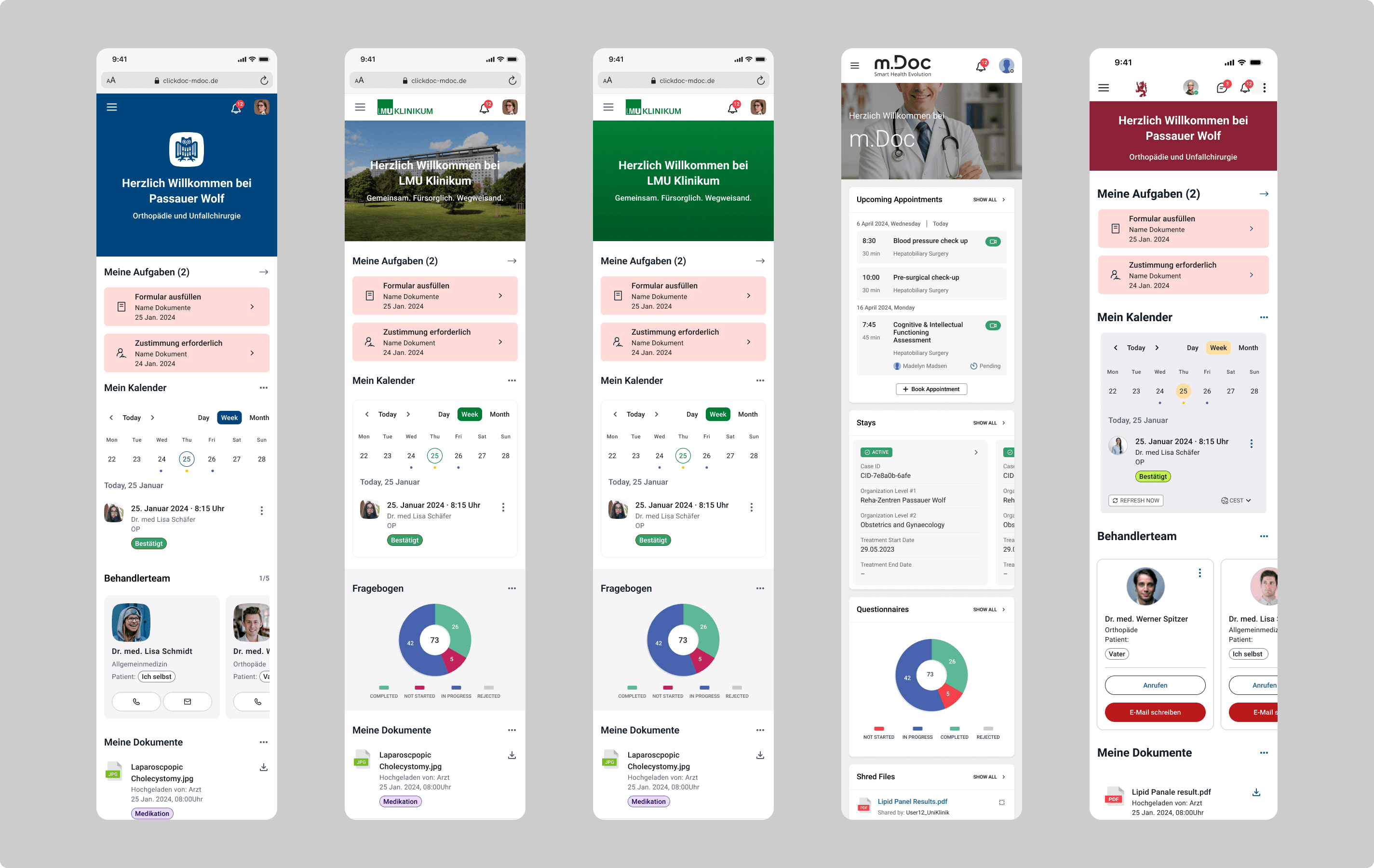
Why it mostly did not work - The timing was wrong before anything else was. m.Doc was already most of the way built and close to delivery, so asking it to stop and rebuild on a different foundation meant undoing real, near-finished work. On top of that, three constraints pulled against each other. VIA was built for breadth, supporting more than twenty other CGM products, so it could not bend to m.Doc-specific needs without risk to everything else on it. m.Doc had a more current design language of its own, its icons, interactions, and finish, so mapping it onto VIA meant giving up quality the product depended on. And we had signed hospitals to a specific look and feel we were contractually committed to deliver, so we could not freely restyle the product either. I worked through it surface by surface. Only the dashboard reached a workable middle ground. The rest could not reconcile the two systems without losing what made either one work, so we kept m.Doc on its own design system.
What I took from it - We tried, and we did not get there. m.Doc was not a small product to rebuild: deep, complex modules, three different user bases, responsive design across desktop, tablet, and mobile, a native app and now a PWA, plus bedside terminals and eCheck-in kiosks. A full rewrite of all of that, on a near-finished product with signed customers, was never going to add up financially or against the delivery dates. The real lesson is about timing: you consolidate design systems at the start of a build, not near the end of one. By the time a product is this far along, with its own language and committed customers, the cost of merging almost always outweighs the saving, however good the reuse looks on paper. The mature call was to test the idea properly, take the partial win where it existed, the dashboard, and stop before forcing a merge that served efficiency and no one else.
Where this leaves me
None of this happened in isolation. I worked day to day with Product, Engineering, and QA, and most of what I am proud of came out of that closeness rather than from designing on my own.
Four and a half years on one platform changed how I work. I came in thinking mostly about screens. I think now about the systems behind them and the unglamorous machinery that decides whether good design reaches a patient at all. That is the part I want to keep doing.
Given the NDA and the sensitivity of patient health data, I cannot share certain screens, figures, or internal specifics here. I am happy to talk through more in an interview.
More case studies from m.Doc
Further work from my time designing healthcare products at m.Doc.